This project was a strategic initiative to increase video engagement and revenue by integrating video into the image search experience across iStock and Getty Images. Through concept testing, navigation redesign, and scalable system thinking, we improved video discovery.
2 PMs, 1 VP of SEO, 1 data analyst, 3 engineers, 1 designer, 1 UX researcher, 1 content designer
Most users on iStock and Getty Images only stayed on the image search results page (*SRP), unaware that video was even an option. This limited business impact and discoverability, especially for users who could benefit from high-quality stock video content for their projects.
We hypothesized this was largely due to discoverability. Users simply were not seeing video in their search experiences. If users saw video alongside images in search results by default, then we expected an increase in video engagement, conversion, and revenue.
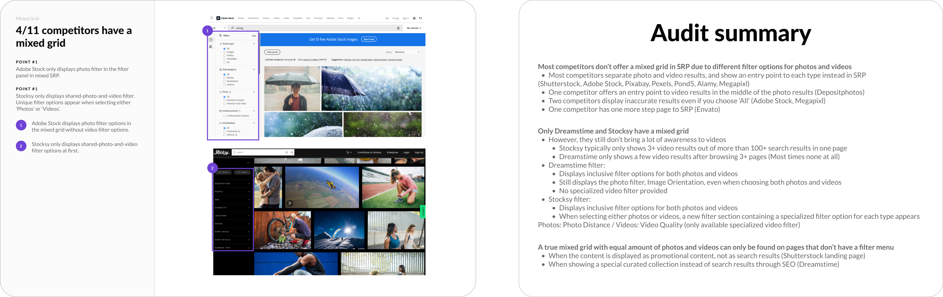
Prior to design exploration, I identified key gaps and patterns through my competitor audit (e.g. video representation in mixed search results, filter logics) that opened up more discussions for the team alignment.
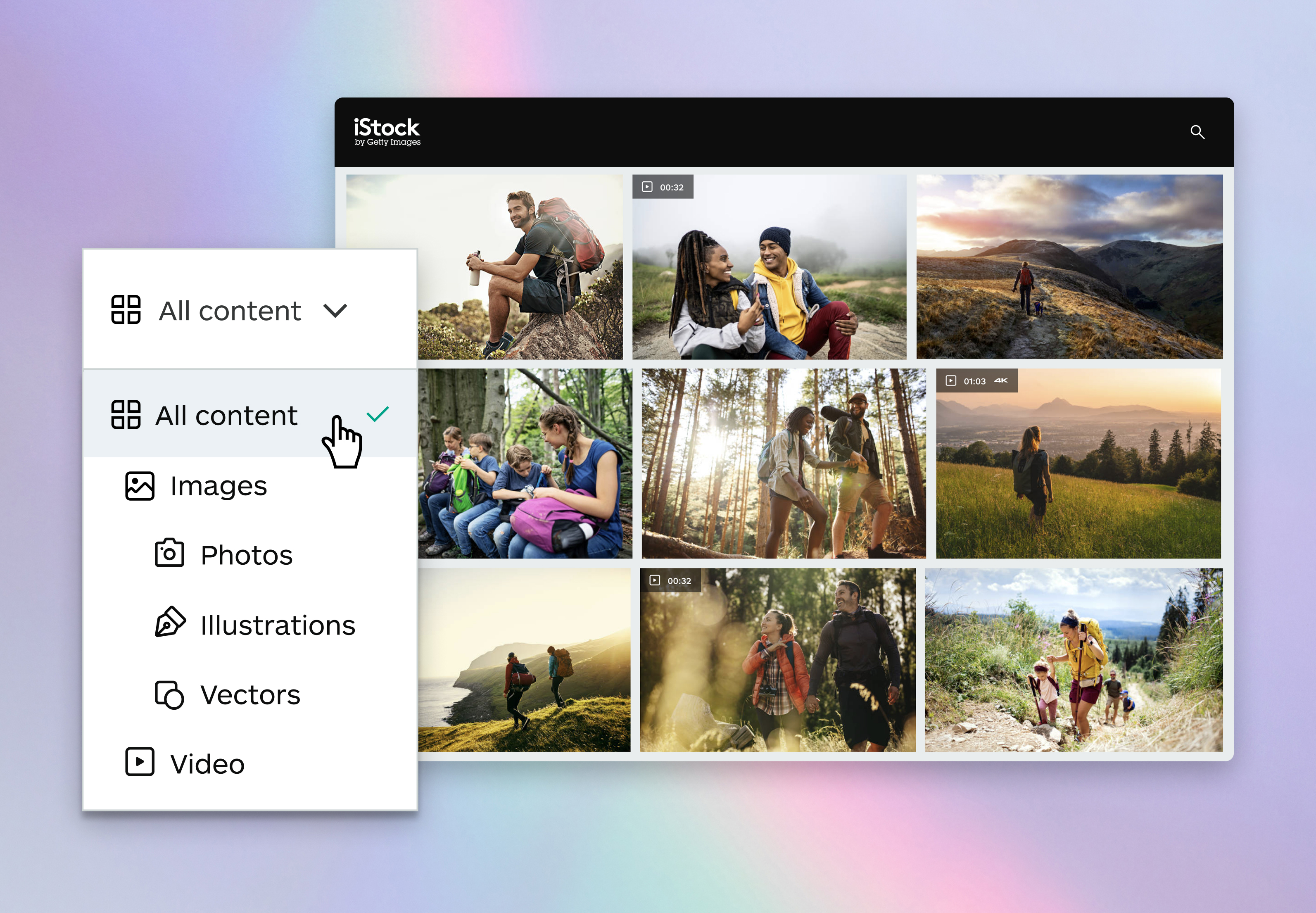
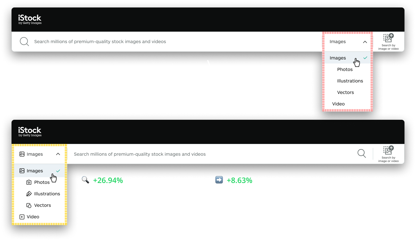
My early exploration for iStock uncovered a broader opportunity to unify image and video discovery through an “All content” entry point.
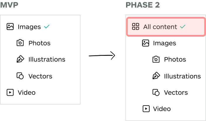
Given the scope and uncertainty of this direction, we prioritized a lower-risk MVP, introducing video within image search to validate user interest before scaling to the navigation model.
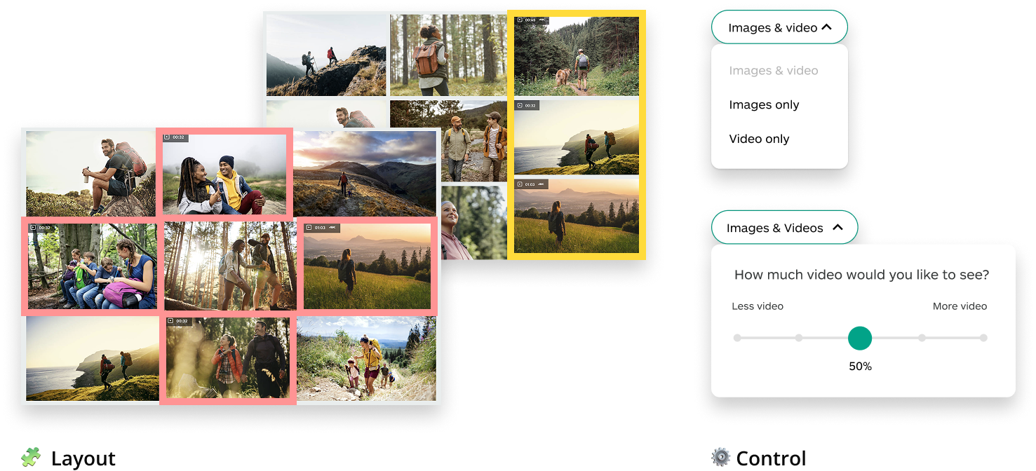
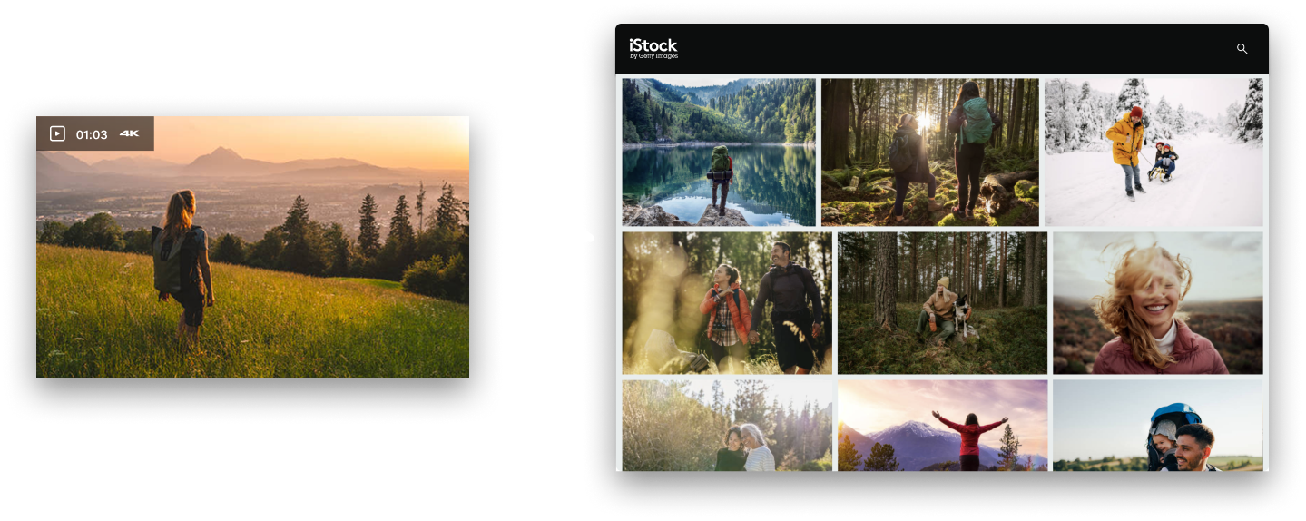
Our primary learning goals were to understand desirability on the feature and user preferences on the grid layout for video results (interleaved vs. side-by-side), and the depth of user control (slider vs. toggle).
The test showed that defaulting to mixed search increased video awareness and conversion. This led to scaling beyond the MVP into Phase 2, a unified “All content” model, which continued to sustain strong engagement.
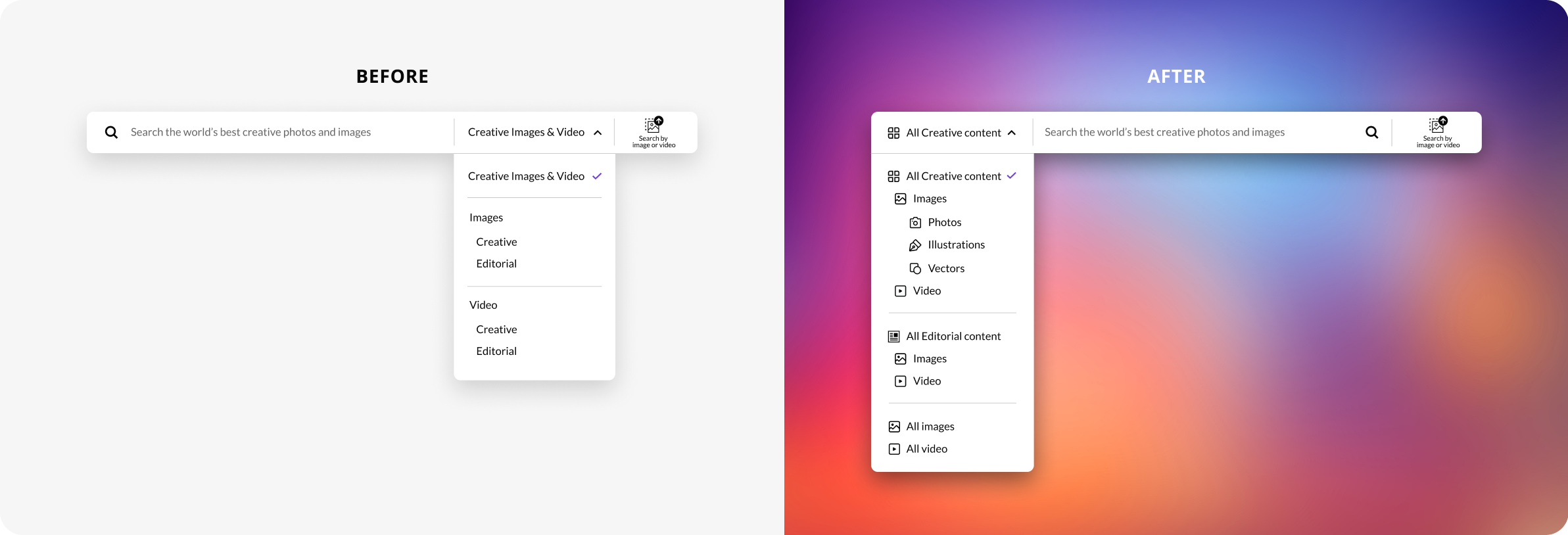
Following the success of iStock testing, we extended the solution to Getty Images by introducing a unified "All content" search model. This required deeper thinking about Getty's existing navigation system.
I proposed a lightweight MVP to enable rapid testing, helping the team move quickly while delivering strong user and business impact comparable to iStock, despite some UX trade-offs.
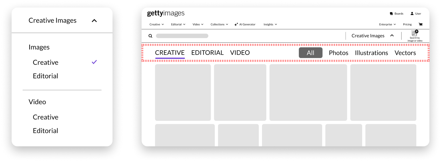
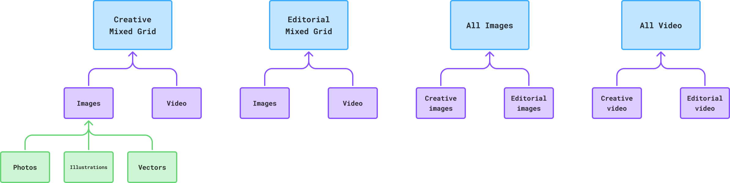
After the MVP handoff, I evaluated the UX to inform a longer-term vision, partnering with PMs and SEO to understand the roles of the "All Images" and "All video", as Creative and Editorial serve distinct user needs.
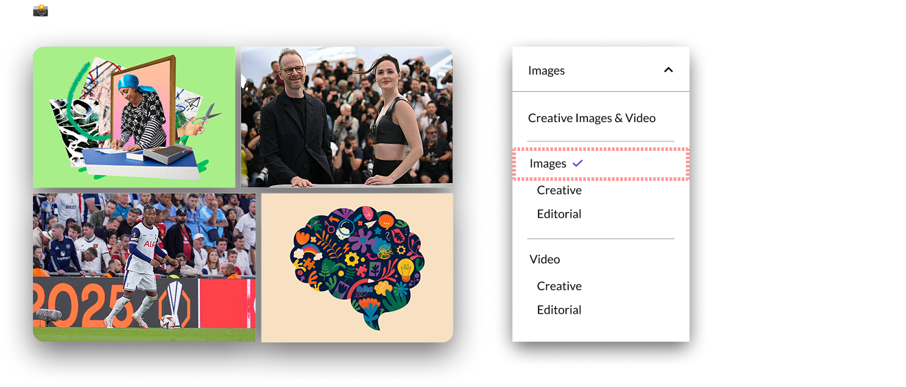
"All Images" showed low engagement but remains critical for SEO and discoverability within search engines.
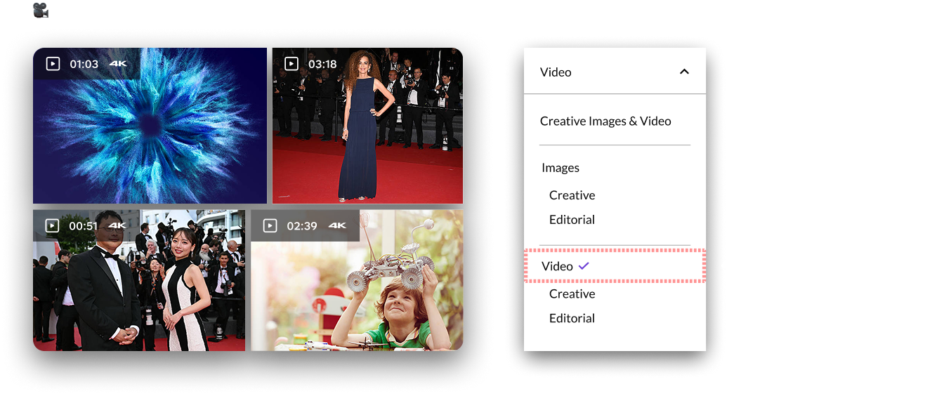
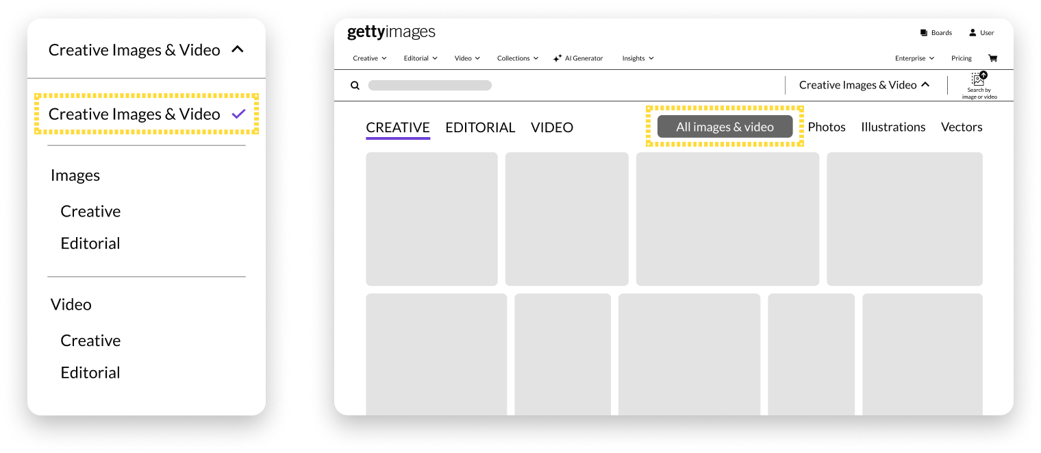
In contrast, "All Video" had stronger user and business value, as users often do not distinguish between Creative and Editorial clips. Maintaining the unified "All Video" option remained essential for usability and conversion.
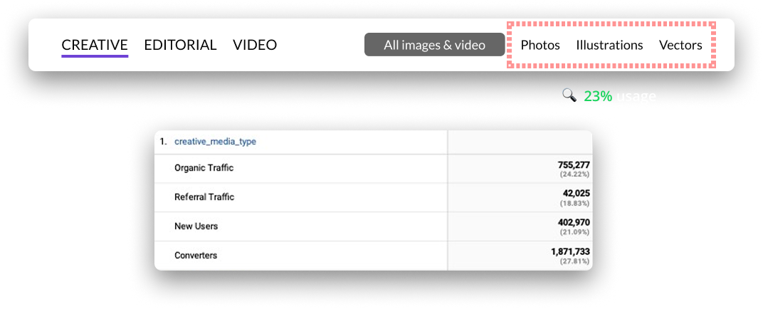
The Creative image sub-menu interactions were high, signaling strong user value. This learning pointed to an opportunity to bring even bigger impact if those sub-menus were more accessible and visible.
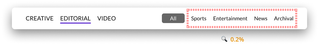
In contrast, Editorial’s topic-based sub-menus had extremely low interaction despite its visual prominence.
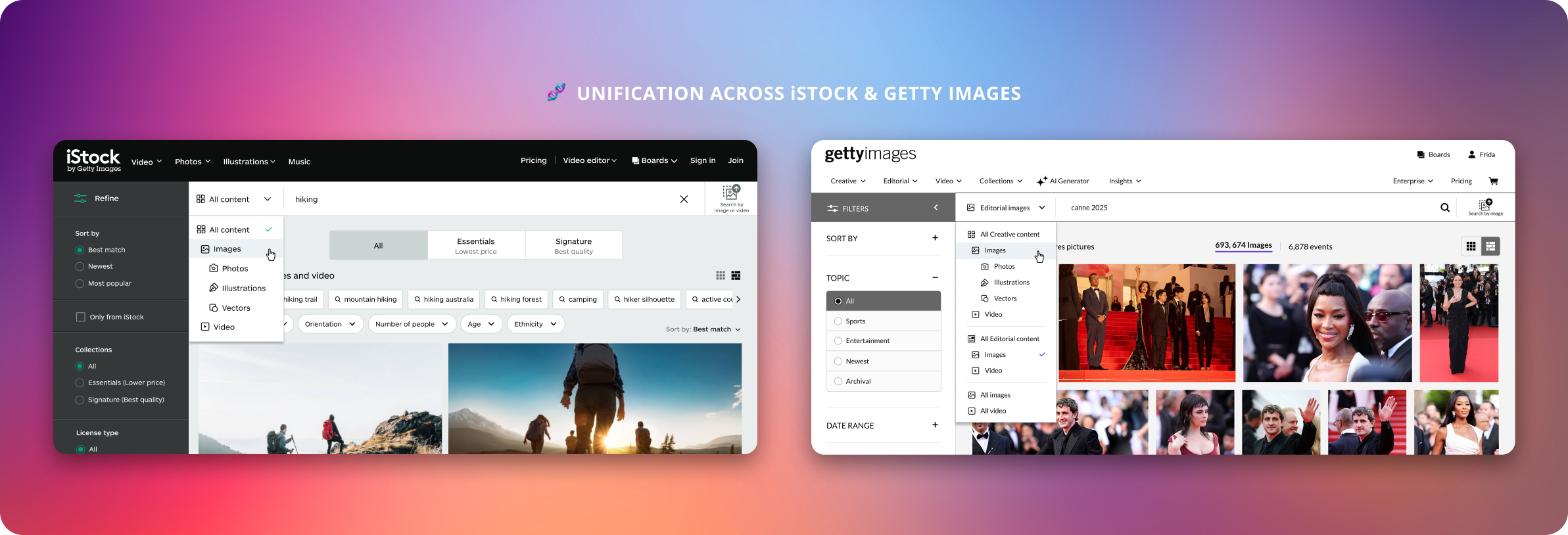
Originally, the "Video" sub-menu was added as an afterthought to support video acceleration. Building on that, I looked at iStock’s search picker testing, where a left-aligned placement with iconography greatly improved interactions and conversion. Then, a more visible and accessible entry point highly increased video engagement. This highlighted an opportunity to increase more video awareness, that could directly support the project's goals.
I synthesized those takeaways from my evaluation and restructured Getty’s information architecture.
The longer-term strategy was well-received by stakeholders but the implementation is currently on hold. This is due to uncertainty around the Editorial mixed image-video search testing, driven by a limited video offering in the Editorial catalog. The alignment on strategy and goals for future iterations is still to be determined.
This project sharpened my ability to make data-informed design decisions that solve immediate needs and scale over time. By analyzing existing data, I identified opportunities, validated assumptions, and guided system-level changes. Starting with a focused MVP let us move quickly, while designing for scalability aimed the product could grow with evolving needs.