Many customers rely on Getty Images for Editorial visuals used in news and articles. This feature aims to provide more variety in image search results to improve search efficiency and experience.
1 PM, 3 engineers, 1 designer, 1 UX researcher, 1 content designer
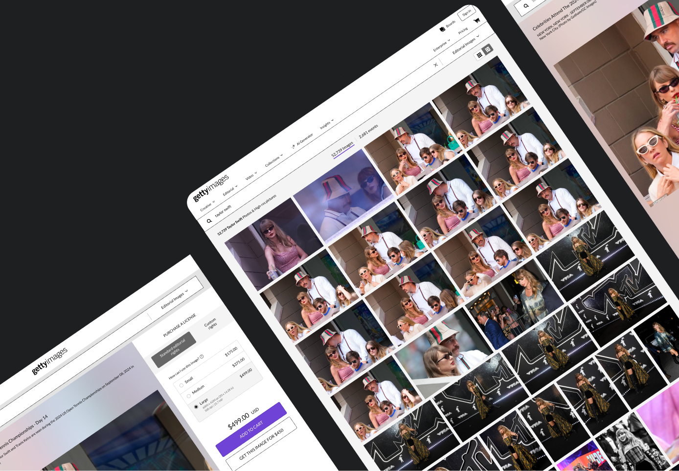
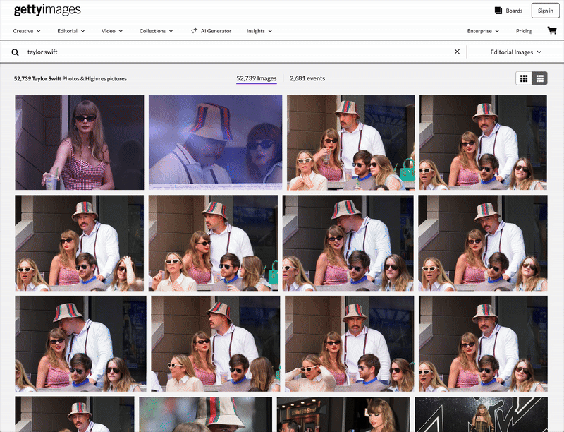
When searching for newest Editorial images, users often face overwhelmingly repetitive shots with a slightly different angle or composition, making it difficult for them to browse different moments and find the right visuals.
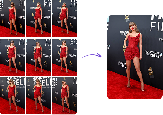
To address the issue of repetitive images cluttering search results, the business proposed an initiative to group similar images and display best images only based on engagement, which enhances search result variety while still allowing users to access additional images when needed.
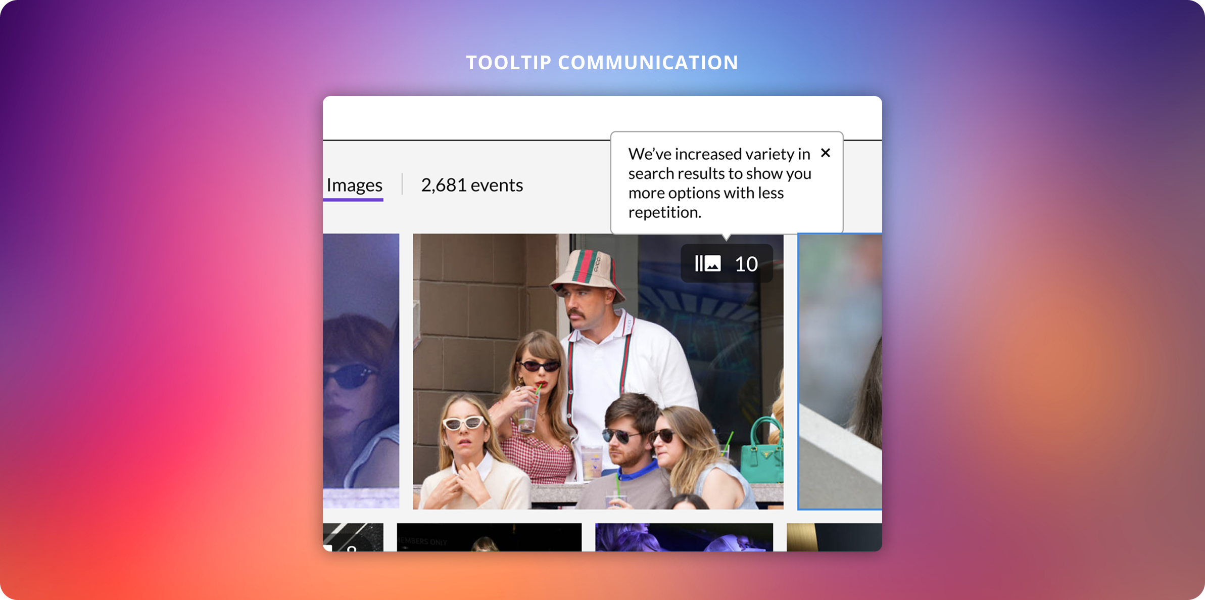
💡 Key question: Should we signal availability of similar shots with a visual indicator in MVP?
Although the design requirments were straightforward, we weren't fully clear about key learnings and directions. And, we were concerned no visual indicator might cause FOMO from users and affect revenue. To align the team on our MVP approach, I facilitated discussions to clarify success metrics and priorities.
Based on the metrics, we aligned on 'search result variety' as the primary goal. To reduce complexity and focus on our goal, I recommended omitting the visual indicator in the MVP for quick testing and validation since learning how users engage with grouped similar content was not our key focus. This direction also allowed us to later validate the value of having a visual signal methodologically in our user research.
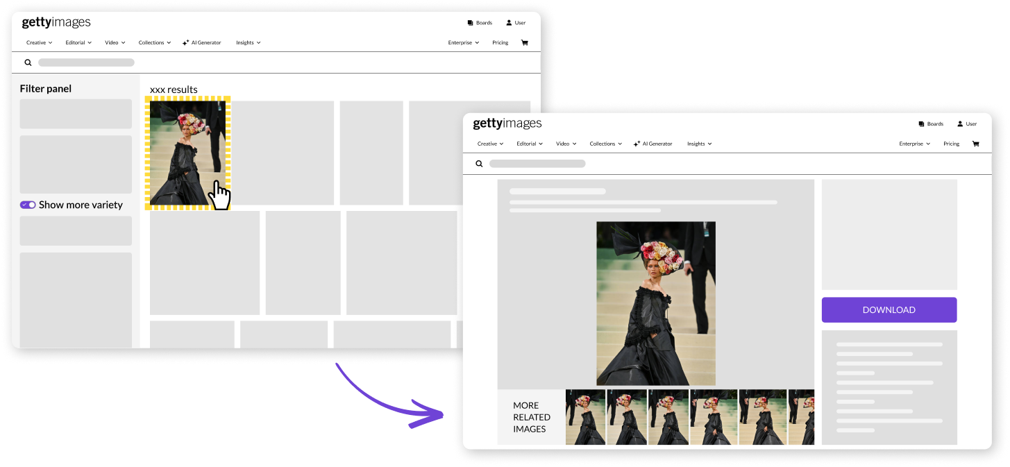
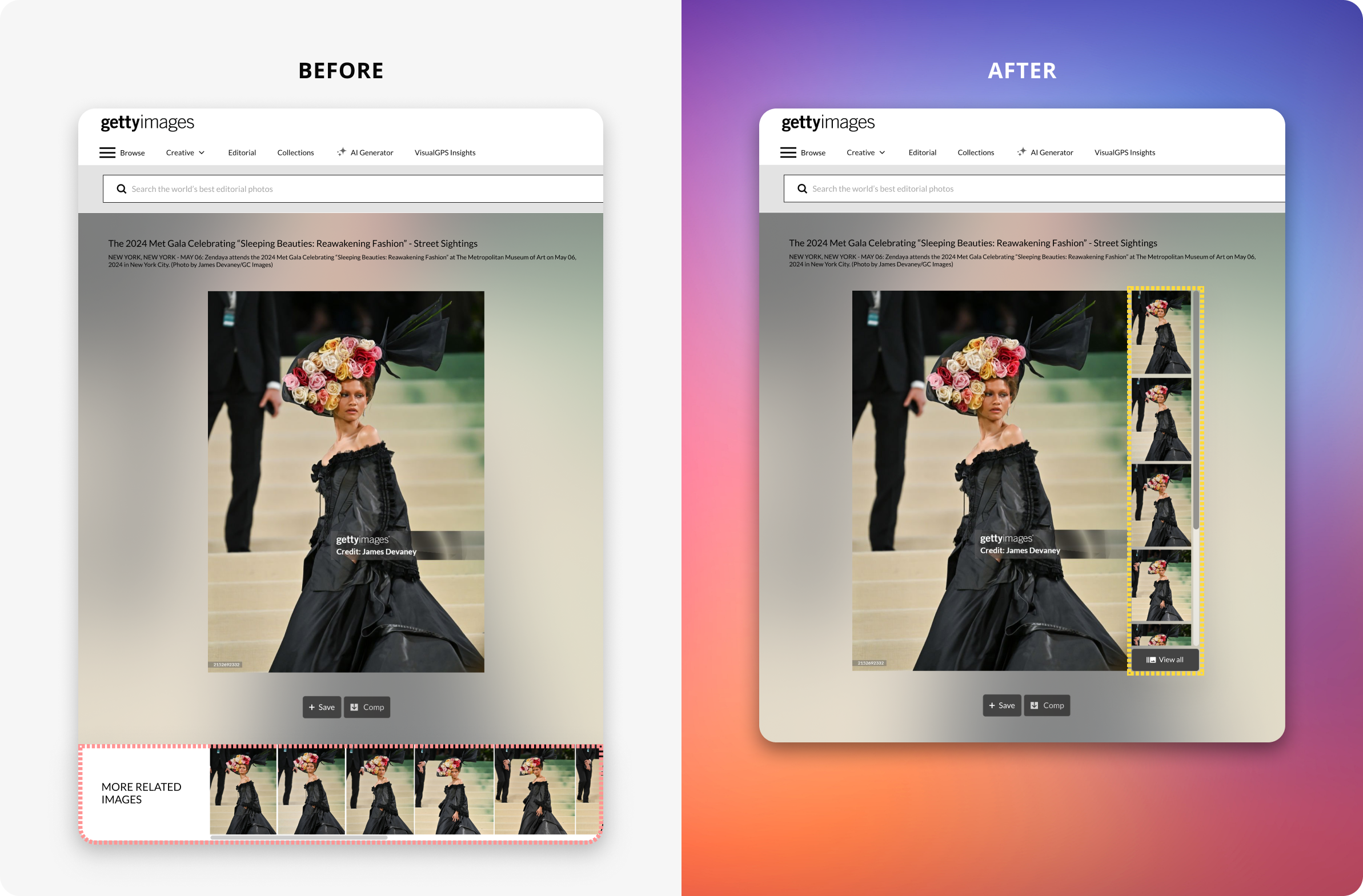
To clearly measure user needs on the feature, we added a control inside the filter panel to turn on/off the grouping. When the feature is on, repetitive images are all grouped together for increased search result variety. Grouped similar images can be found under the main visual on the image detail page, utilizing an existing component.

I collaborated with a content designer to provide clear toggle copy. The initial copy focused on the grouping mechanism instead of the beneift and felt too technical. The second one tried to focus on the benefit but the term, increased variety, introduced ambiguity. I suggested more straightforward, user-friendly and action-oriented copy, leading to the final copy: “Show more search result variety.”
Users found engaging images faster, reducing search fatigue.
More efficient, quicker image evaluation process for download.
Increased variety reduced unnecessary browsing.
While on-site testing confirmed the feature’s positive impact, we hoped to better understand user's workflow, frustrations, and sentiment around search result variety so we conducted unmoderated user testing.
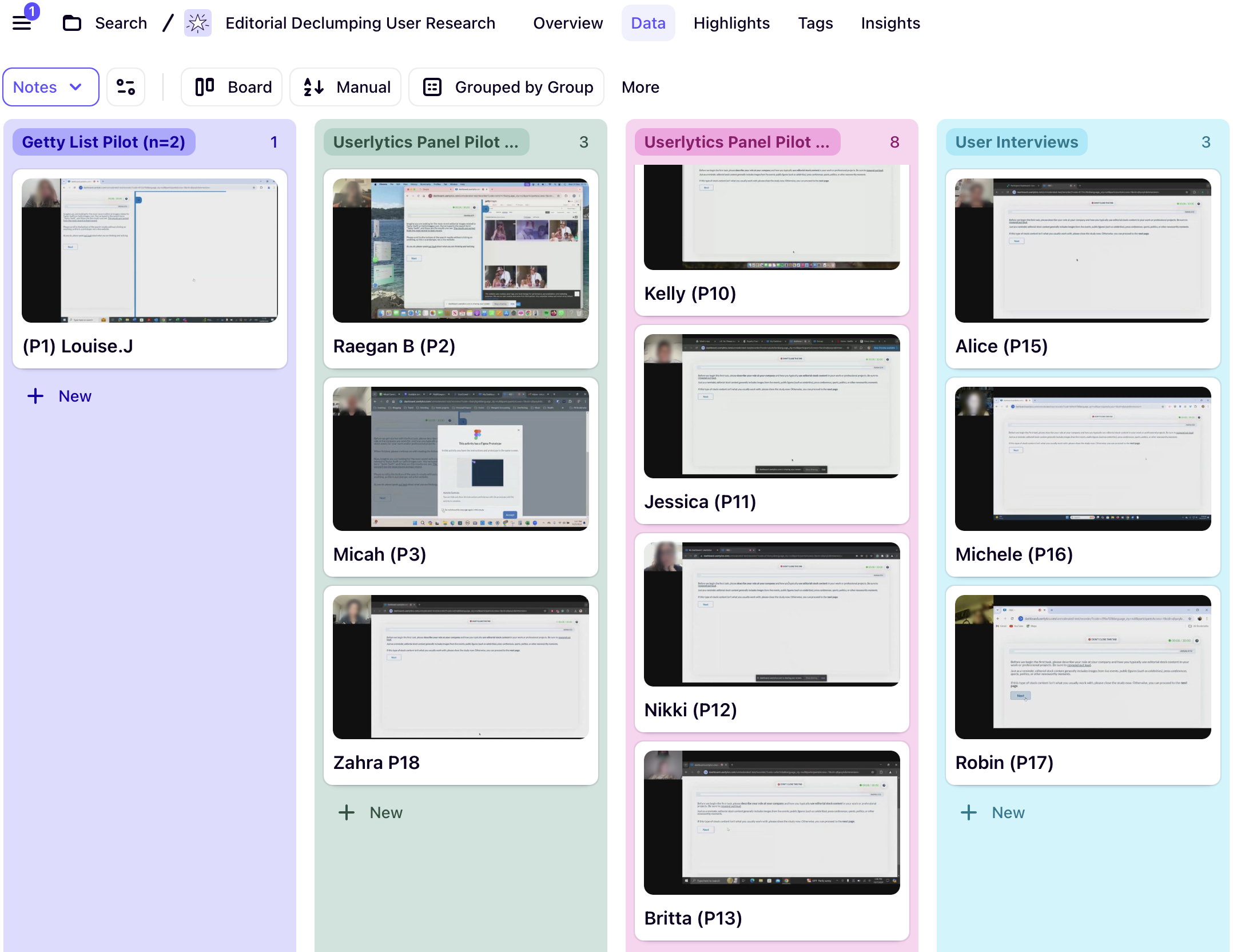
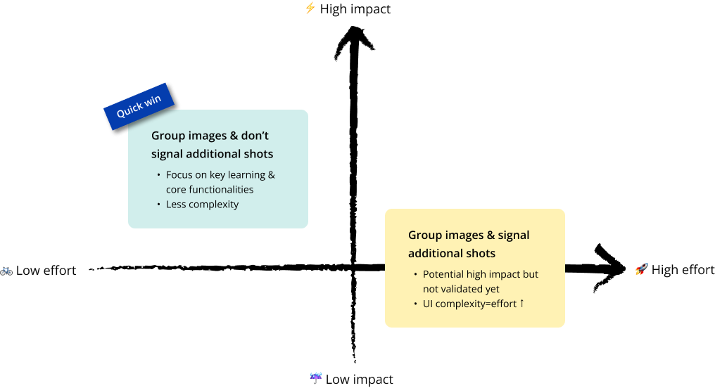
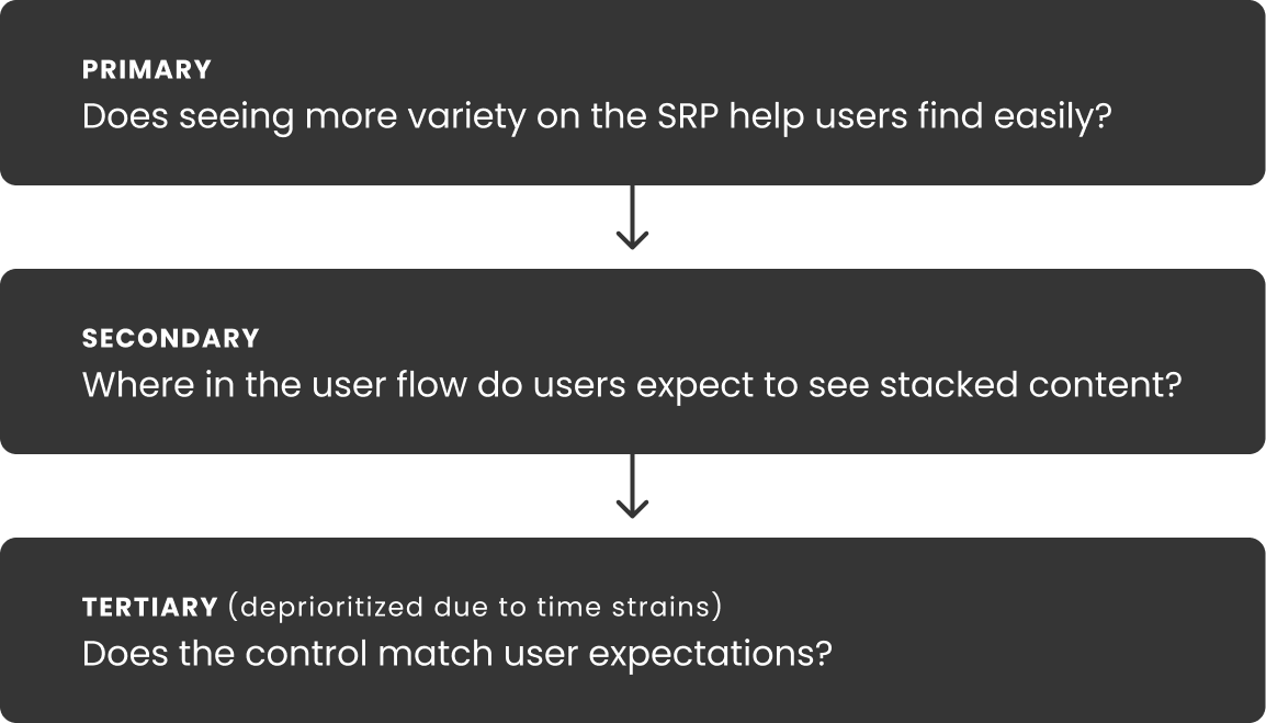
Prioir to testing, to ensure focus on high-impact learnings, I came up with a goal prioritization table. Based on this prioritization, we narrowed down our list of questions and tasks more strategically and clearly.
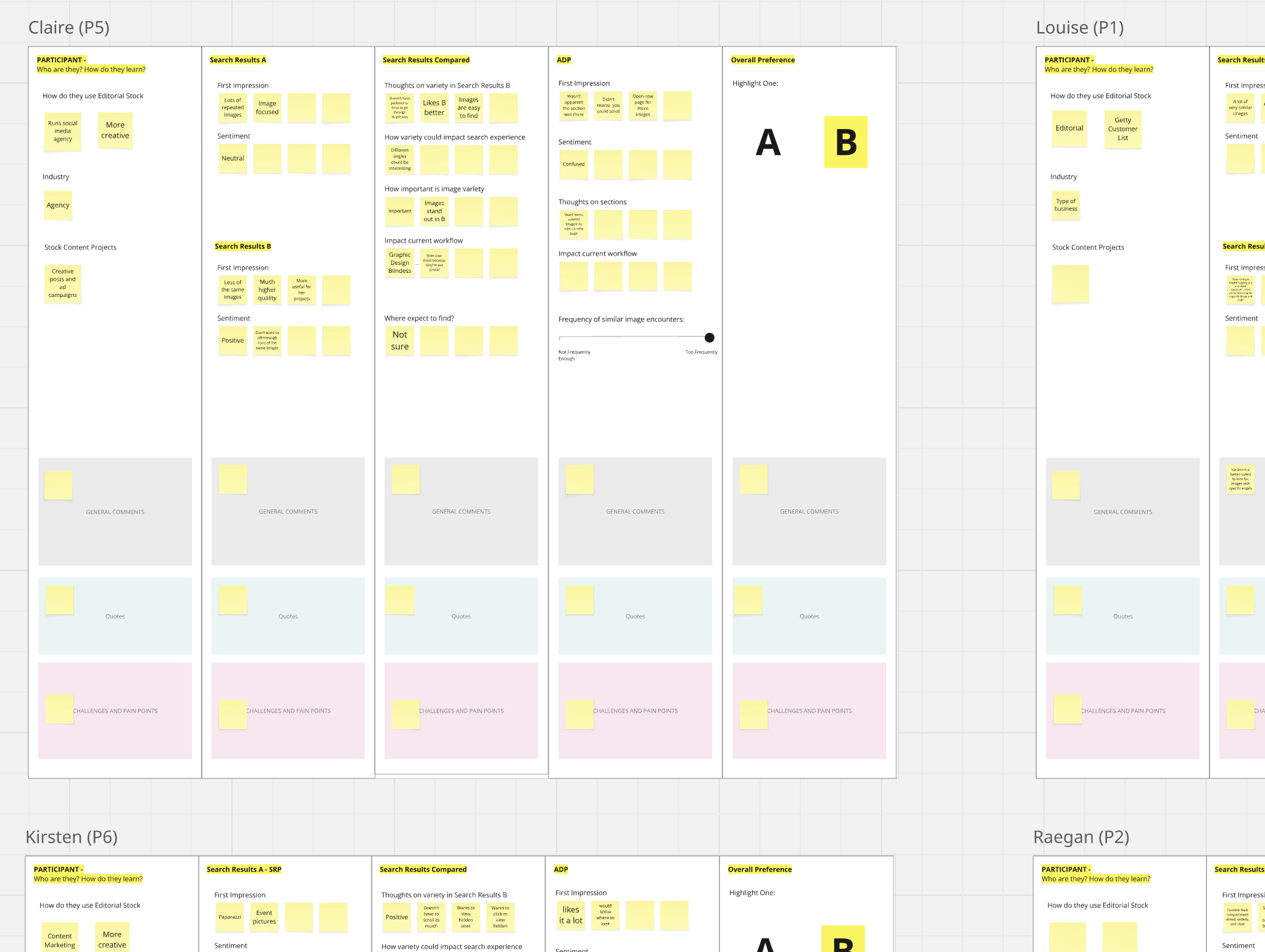
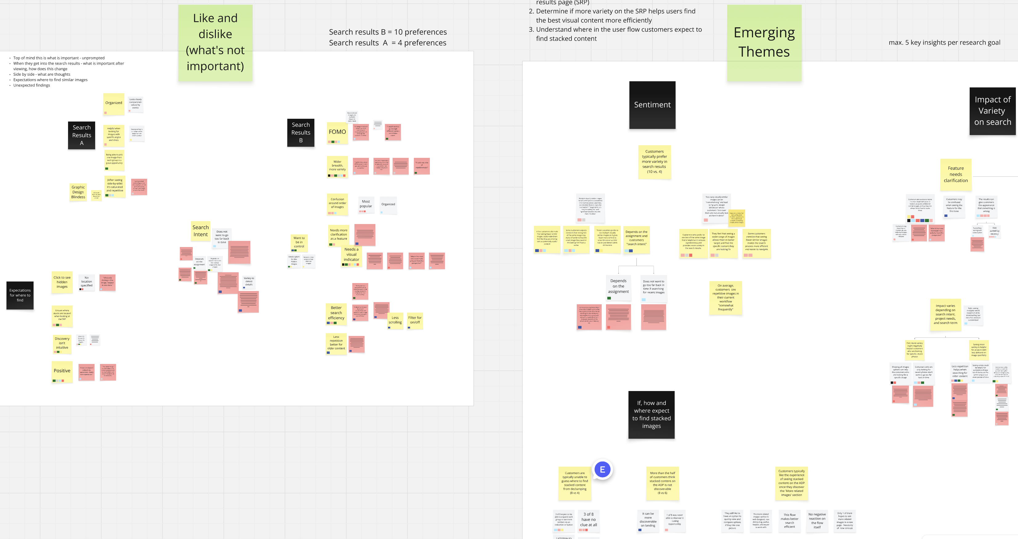
After unmoderated testing, we put together overall syntheses to understand general sentiment. Below are 3 main takeaways:
Based on the takeaways, we refined the design to improve transparency and discoverability.
While the refinements were driven by qualitative insights, our on-site testing primarily measured search result variety, not the direct impact of repetitive images on engagement or conversion rates. To bridge this gap, we are planning to move forward with A/B testing to validate the impact of the visual indicator before finalizing its rollout to production.
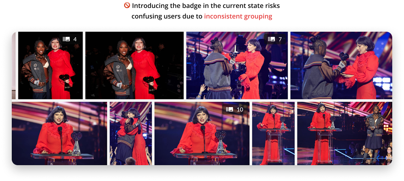
Although the business was eager to test the visual indicator, I raised concerns about potential user confusion. The current grouping algorithm occasionally leaves similar images ungrouped, which could undermine trust in the badge. I recommended holding A/B testing until the algorithm is more consistent. The team is now focused on improving grouping accuracy before further testing.
This project strengthened my ability to lead through ambiguity and balance user needs with business goals. I facilitated alignment when project objectives were unclear, helping define a strategic direction. Later, I challenged assumptions by advocating for A/B testing over shipping based on qualitative feedback alone, ensuring we delivered meaningful user value and measurable business impact.