I led the redesign of our patient enrollment portal end-to-end, one of the company's core internal tools. This case study highlights how early user research shaped our redesign approach, resulting in a more intuitive, scalable, and user-centered experience.
1 CEO, 1 PM, 1 design manager, 1 designer, 3 engineers, 3 QAs
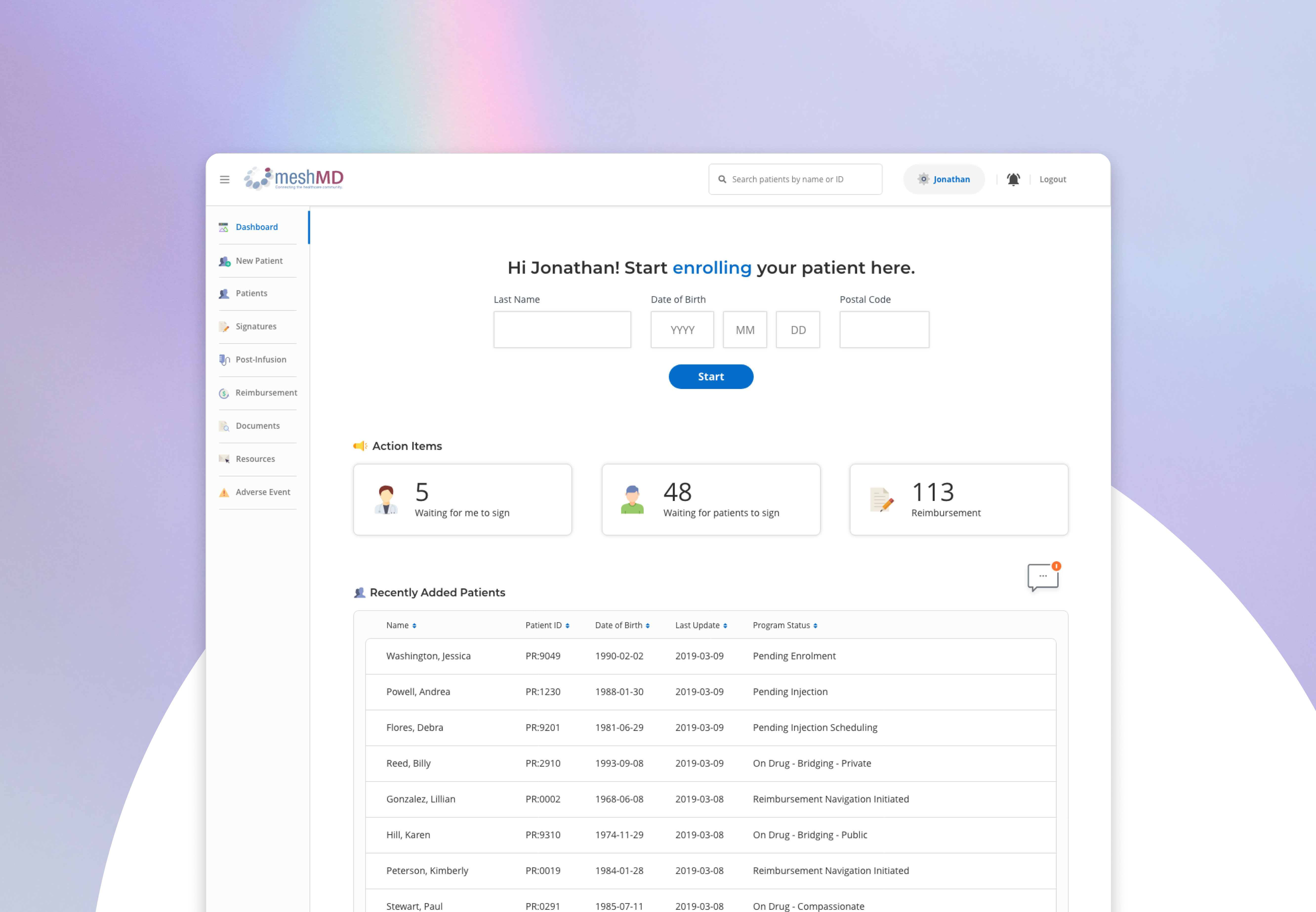
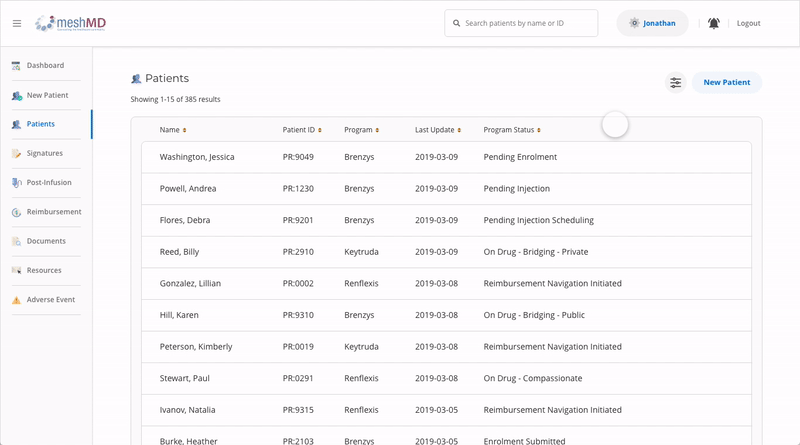
The existing portal was built on assumptions, with no formal user research to validate user needs or behavior. As usability issues and outdated visuals became more apparent, the business initiated a redesign to improve both UX and UI.
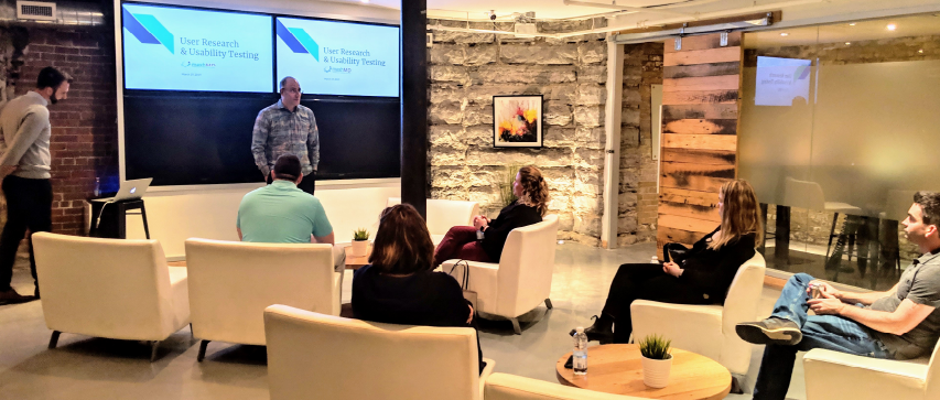
To ensure a more user-centered outcome, we conducted user research to uncover how users actually navigated and experienced the portal. One of the key learning areas was form flow since the digital form flow was one of the highlights of our product. So, we incorporated A/B testing to understand how users would like to fill in forms digitally (typical form flow with all questions on a screen vs. step-by-step flow with one question at a time).
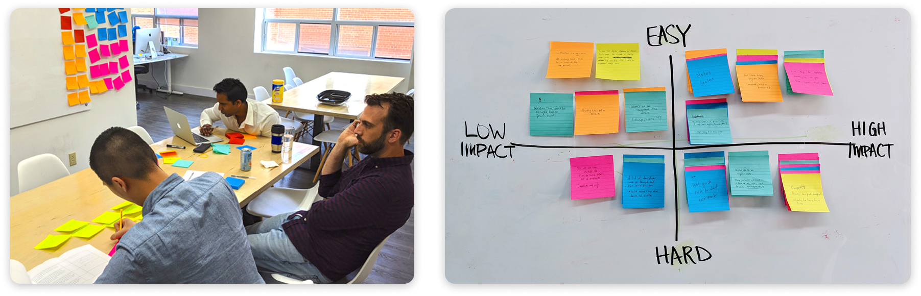
Afterwards, we synthesized our findings, using an impact vs. effort matrix, which helped us identify quick wins for implementation. Key takeaways include: :
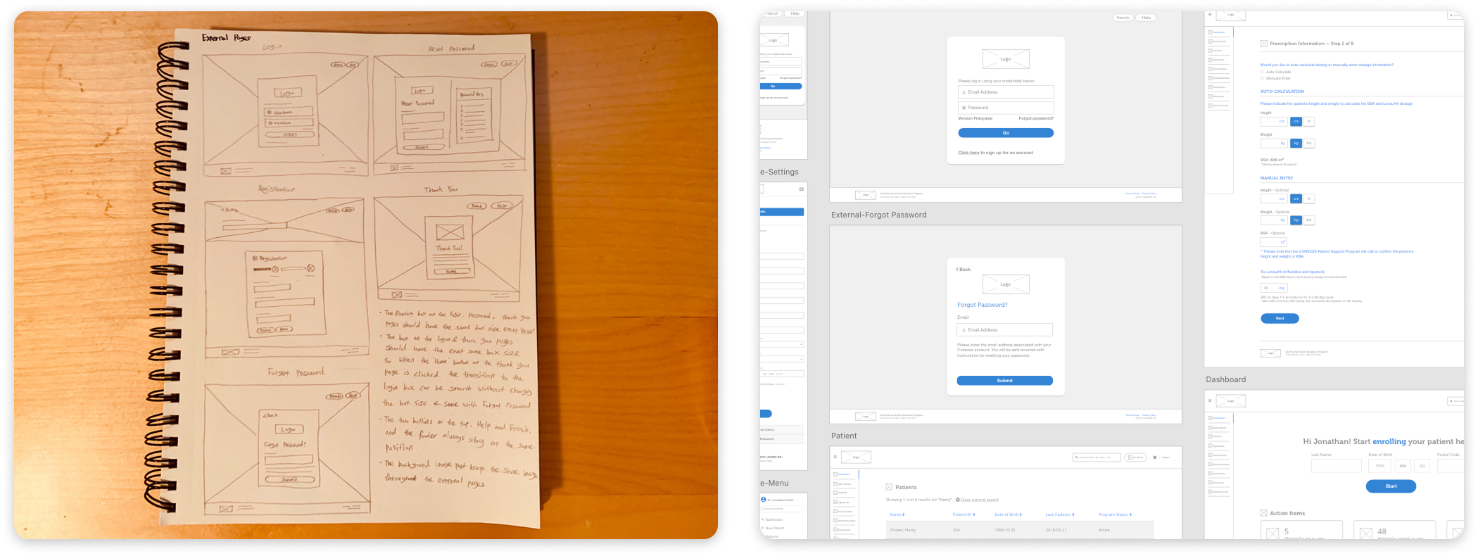
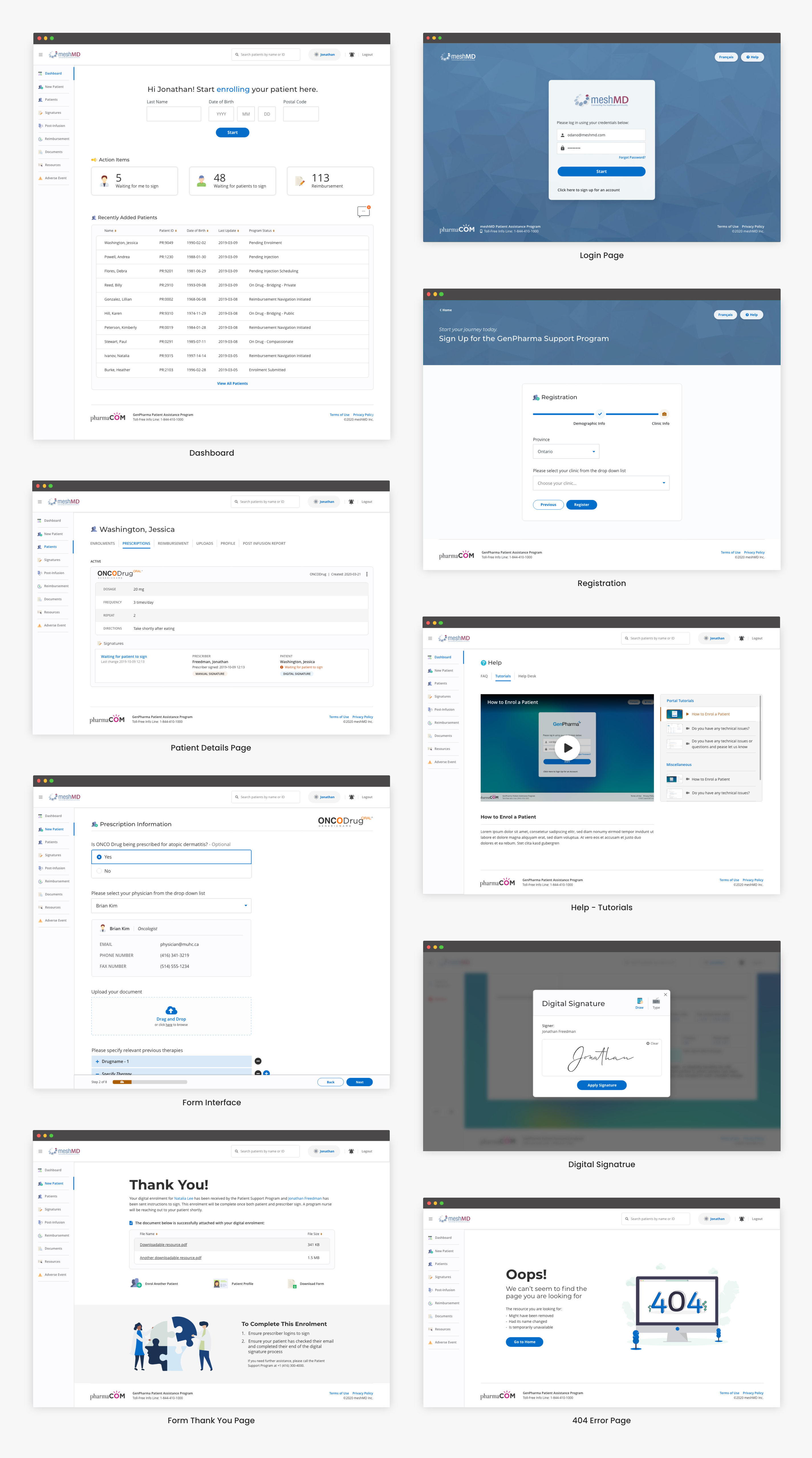
To illustrate ideas on a redesign with the new insights, I dived into design explorations. For quick alignment on structures and functional UI with stakeholders, I communicated with low-fidelity wireframes.
Before
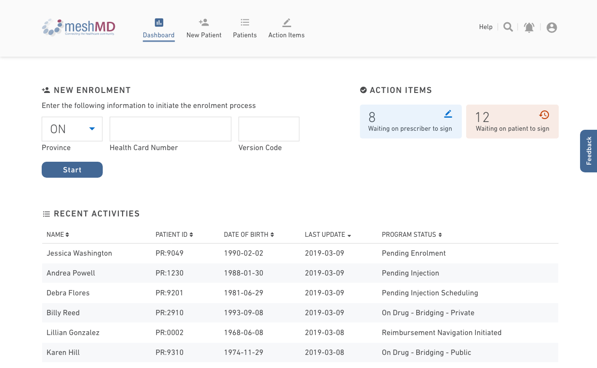
After
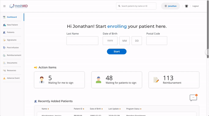
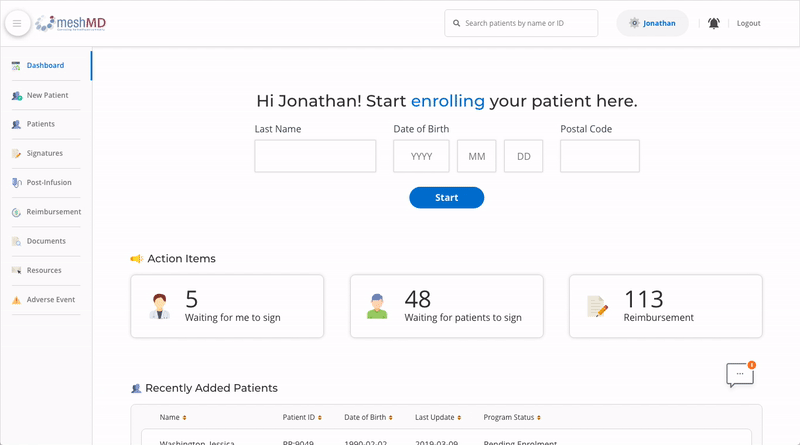
Before

After
Before
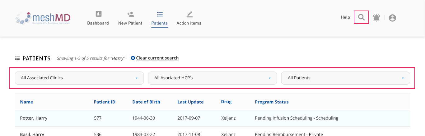
After
This project shifted my mindset from solving surface-level problems to designing based on real user behavior. Conducting research upfront helped uncover workflows and pain points we hadn’t considered and ultimately led to a more focused, user-centered solution.
It reinforced the importance of starting with curiosity and letting user insight guide design decisions.
This project taught me the importance of designing with the future in mind. While I initially focused on the current navigation needs, I later realized the value of planning for growth and scalability.
It was a valuable reminder that as a product designer, anticipating future use cases is just as important as solving today’s problems