Case Study
Mood Tracker App for IBD Patients
Mobile app for patients with IBD (inflammatory bowel disease) to log their mood daily and track the trend, including a bathroom finder and helpful recipes.
UX / UI Designer (Research, User flow, Ideation, Wireframes, Visual Design)
Today, 5 million people are suffering from IBD, inflammatory bowel disease. IBD is an umbrella term that includes the two most common types of chronic inflammation of the gastrointestinal tract, Crohn's disease (CD) and ulcerative colitis (UC). A common IBD symptom is diarrhea which generally means urgent trips to the bathroom. Those flares are often aggravated by certain foods or products, but tolerance to those foods depends on each individual.
The client wanted a mobile solution for those tricky bowel issues by allowing users to write a journal about their mood after eating and track their mood trend. They also wanted a bathroom finder feature as well as a recipe section for anti-inflammatory dishes.
Considering the complexity of the journal feature including mood rating, a food database, filtering for both mood and food, as well as a trend graph, the main challenge for me was 'how might I make this complex system easier for anyone to learn and use?'
Some IBD patients go to bathroom as many as 20 times a day. What if they should use a bathroom nearby right away but mobile bathroom finding experience is too complicated or takes too long? A mobile-friendly solution for quick searching was crucial.
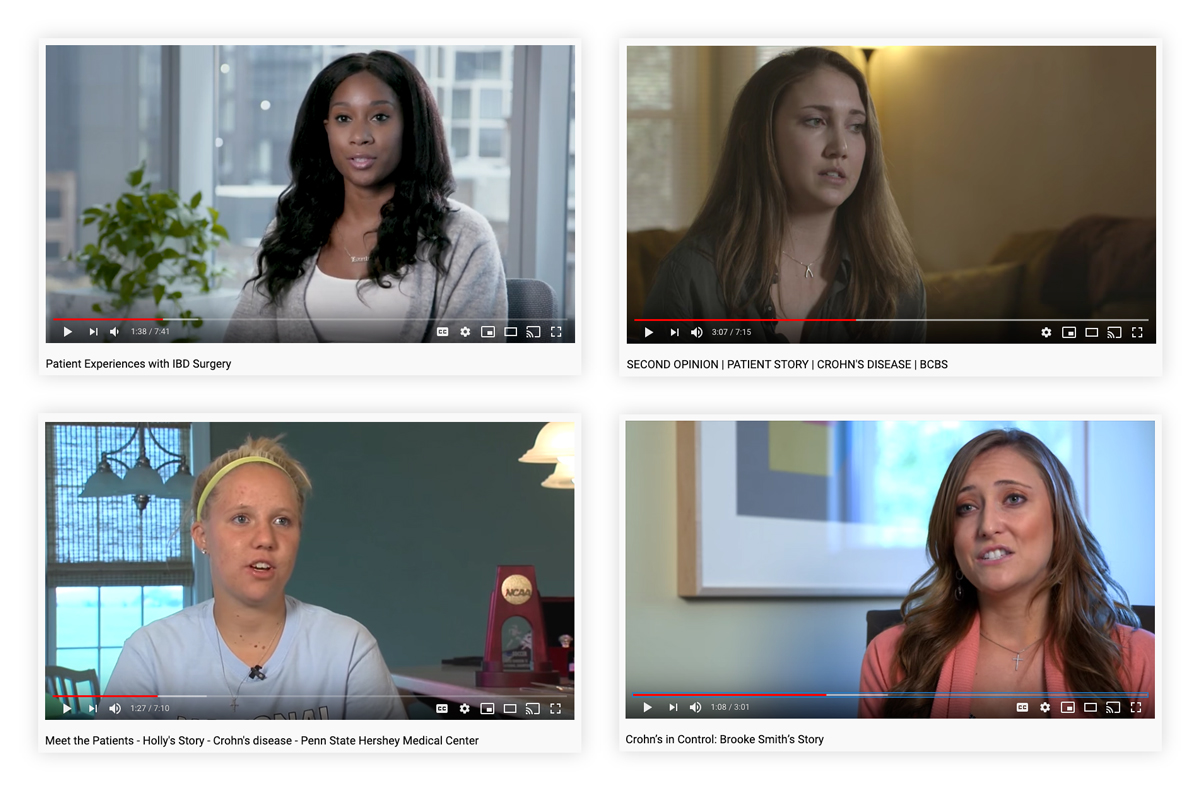
As someone who has never had IBD, I needed to truly understand what IBD is and what my users are going through daily. Since there was no access to interviewing any patients, I relied on researching online on the disease and the patients. I found the YouTube patient journey clips to be a helpful alternative. Through seeing their faces and hearing their stories directly from them, I was easily able to understand their pains and emotions, and build stronger empathy. Watching those videos, I wrote down their common challenges, personality, behaviour, and anything enough for me to make a persona.
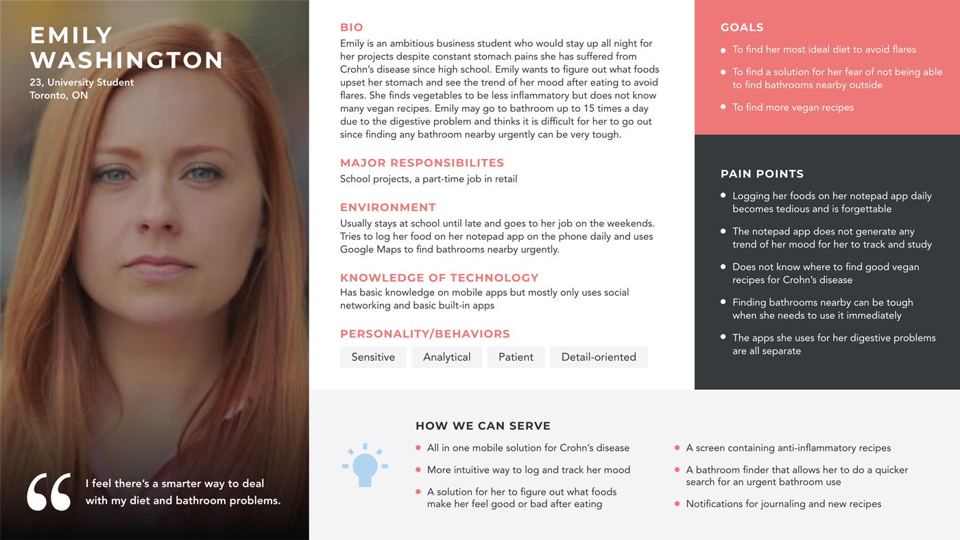
Based on my user research data, I created a persona to set a model for this new kind of project that we had never had before. This process helped me organize all of the user data mixed up in my head, and get a better grasp on the users. It also provided some insight on how to approach the problems and what to focus on to make their lives easier by developing an usable product for them ultimately.
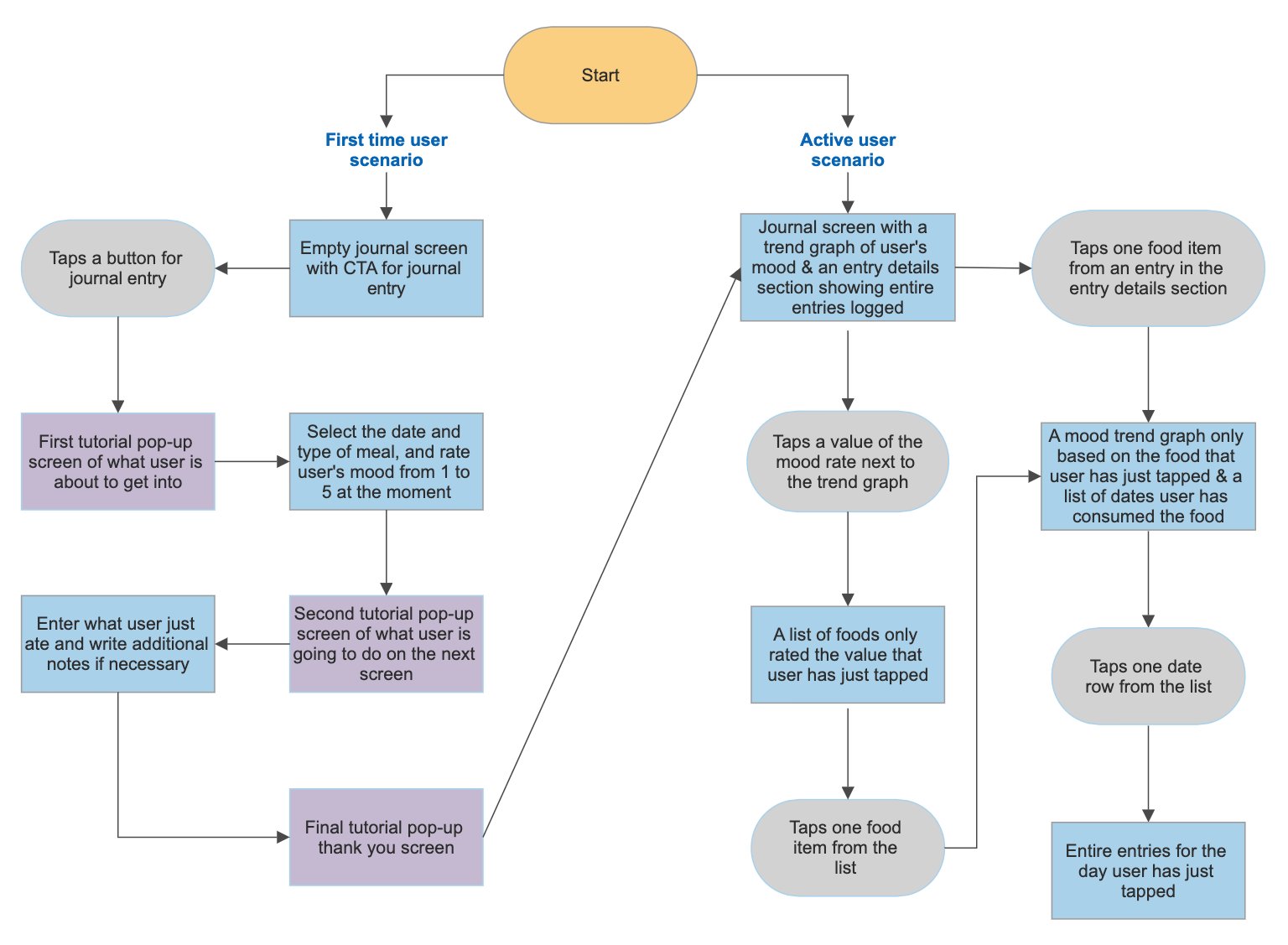
After the user research, a director of design, Jonathan Chetner, and I brainstormed together for the Journal feature on the whiteboard. From there, we captured some good ideas and came up with rough workflow ideas. Translating all those ideas into a flow was challenging since it was a quite complex system with two different user scenarios. To map out the whole flow properly and ensure the workflows make sense, I created a flowchart. It became a convinient reference for me to keep checking during the end-to-end product development. It also helped me visualize the feature prior to designing.
I started off with sketching the journal part, the highlight feature of the app, and then other screens. After the sketch process, I made lo-fi wireframes for the whole mobile experience. During the lo-fi step, there were a lot of iterations and back and forth for the Journal feature from our stakeholders due to some design direction conflict as well as internal user testing results. I needed to find the layout that works best.
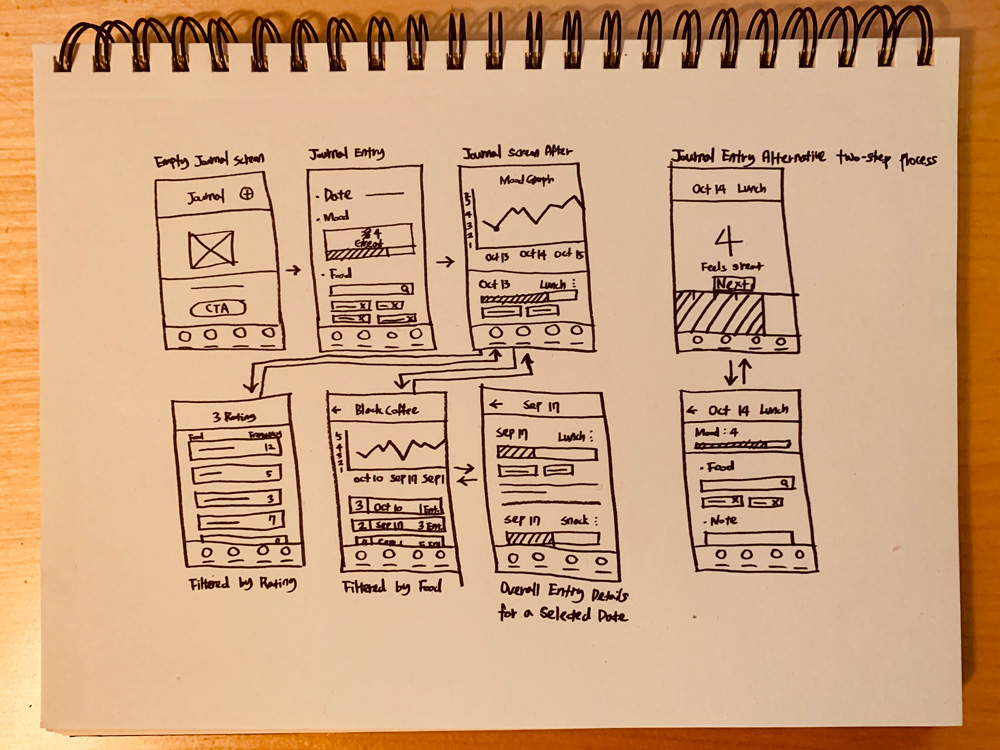
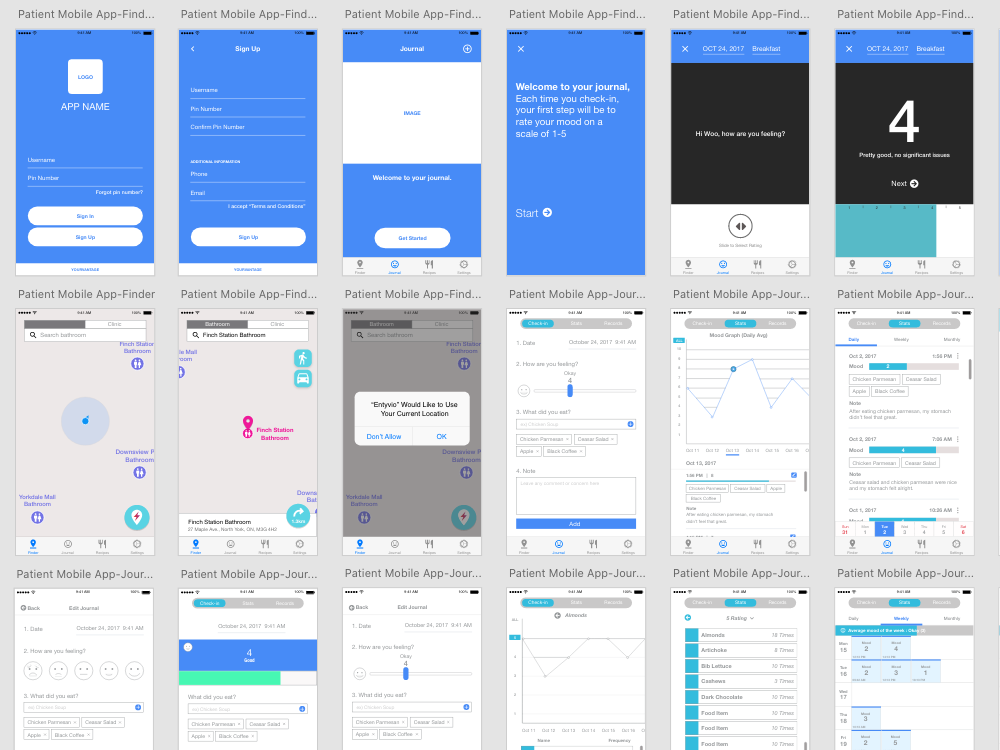
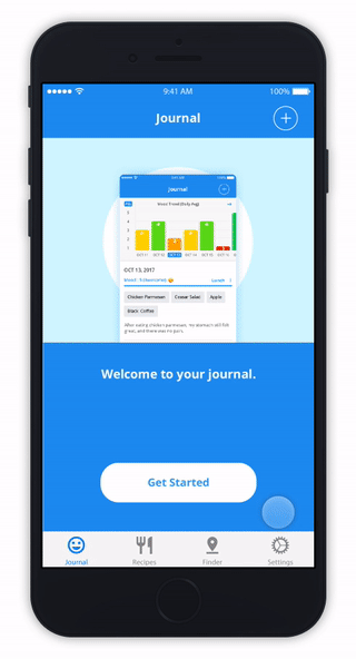
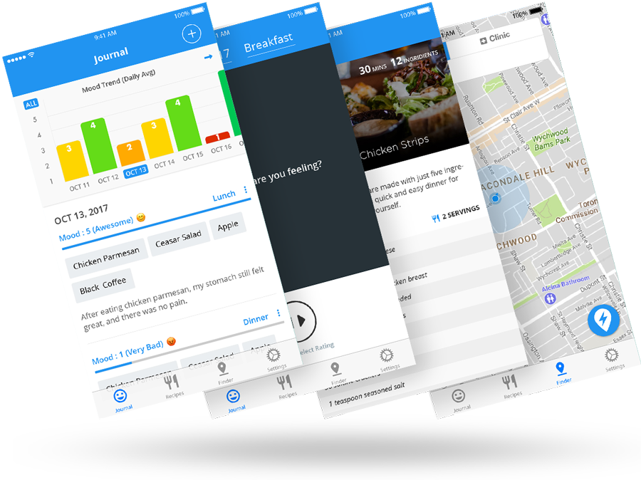
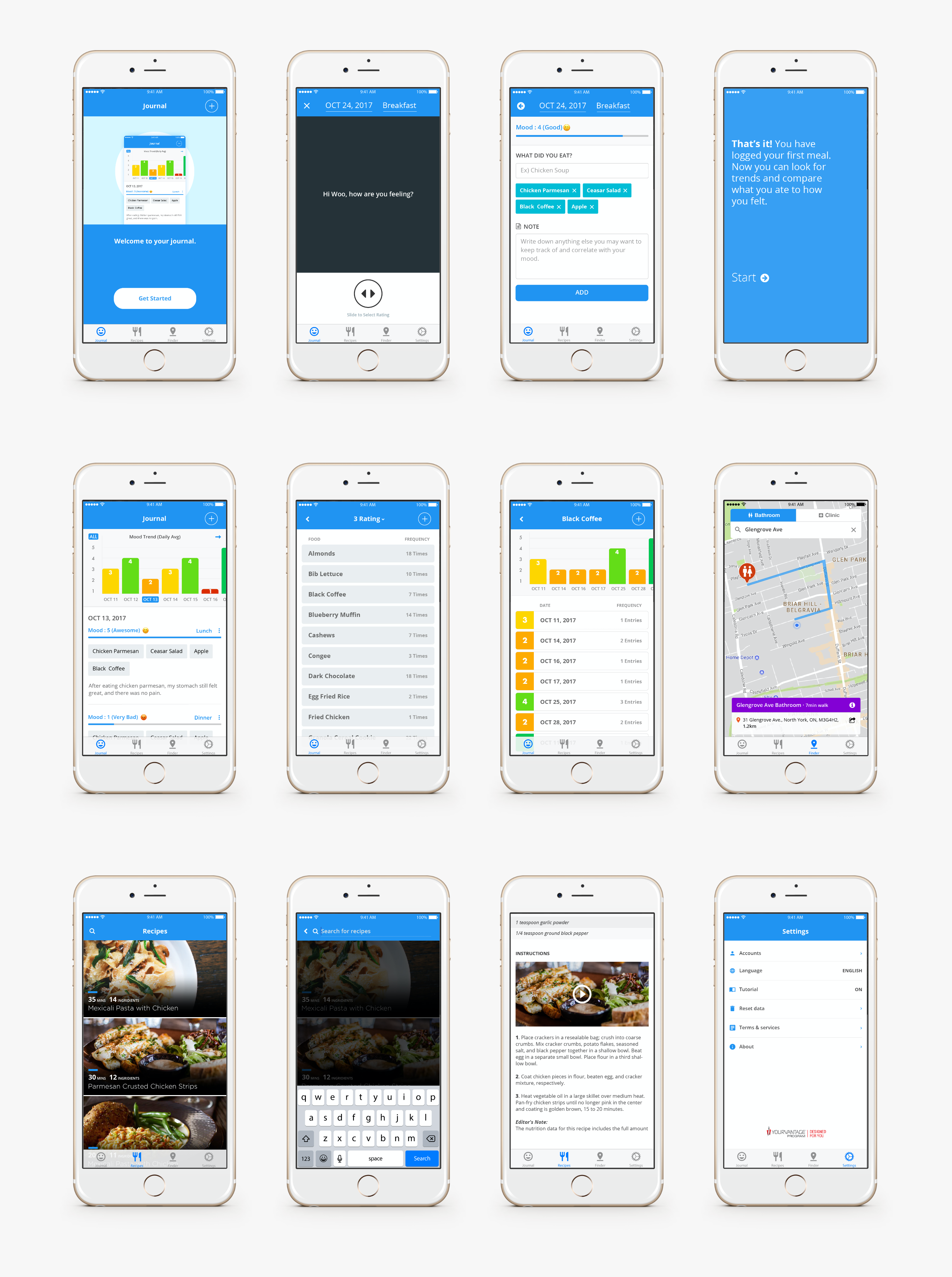
For a more engaging and easy-learning experience, the journal entry process is broken into two steps. To lessen a learning curve, it includes a tutorial on each step as well. After entries are logged, a user can find a mood trend graph based on meals at a glance on the next screen.
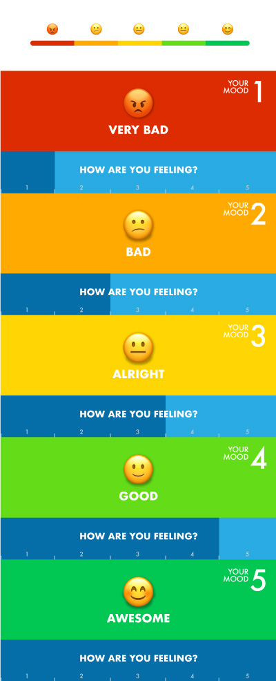
For the colour scheme of the graph, I used five different colours to represent each mood statement. This colour scheme will make the graph more easily distinguishable without looking at the rating.
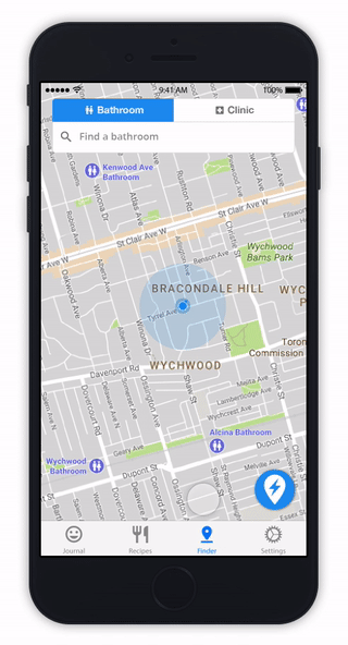
Every second matters for an urgent bathroom use. For a quicker bathroom finding experience, I incorporated a smart button () at the bottom of the screen. This button finds a user the nearest bathroom and also the easiest walking route to the destination without having to search.
Utilizing free online resources for research: I had to look for alternative options for user research as I did not have access to users. Then I found some video resources on YouTube, which I found to be as helpful as an actual user interview. And, I was able to understand the subject of the app and my users better through the online research. This made me realize plenty of free resources are already there for anyone to utilize even if there is no budget.
Testing regularly on the phone: While designing the mock-up screens, I used large grids for left and right paddings, and small font sizes for a cleaner look. However, when I tested the prototype on a phone after I finished all the screens, I was not happy that everything looked smaller than I expected. There were accessibility issues with small text on mobile as well. In the end, I had to revisit all the screens and resize the paddings and font sizes. To avoid this situation next time, I would keep regularly testing my designs on mobile.